
Spot the difference. Part 2: Analytic Choices
- Authors:
-
Posted:
- Categories:

This article is part of a series: Spot the difference: differences in prescribing datasets
- Spot the difference. Part 1: Source Datasets
- Spot the difference. Part 2: Analytic Choices
In the second of this two part blog series we will walk through why differences in analytic choices can make results look a little bit different.
As we described in our previous blog, one of the most common questions we are asked at OpenPrescribing is, Why does my OpenPrescribing output not match what I have found on another data analysis platform?
At OpenPrescribing we anticipate that our results will not always be exactly the same as those displayed on alternative data analysis platforms due to two main reasons:
1. the other platform is using a different source dataset (discussed in Part 1) and
2. analysts have made different analytic choices in the alternative data analysis platform to what we have made on OpenPrescribing.
Different analytic platforms can make different analytic choices
There are different data analysis platforms such as ePACT2, PrescQIPP, Fingertips and OpenPrescribing, which are used to analyse and visualise the underlying source dataset. The people running each platform will make different analytic choices for data preparation, analysis and visualisation, which can mean that the results and visualisation reported are different even though the source dataset is the same
Recently our team at OpenPrescribing received a query from a medicines optimisation team, regarding a difference in trends reported between data analysis platforms for co-amoxiclav, cephalosporin & quinolone prescribing over the same time period. In OpenPrescribing there was a positive trend, whereas in PrescQIPP and ePACT2, the user reported a negative trend. The user wanted to understand why the different data analysis platforms were giving different results. As OpenPrescribing shares the same source dataset with PrescQIPP (and others) differences in results are likely to be due to analytic choices made by the people running the platforms.
What analytic choices do people running data analysis platforms make?
The most common differentiating analytic choices are the use of different time periods, and the definition of the numerator/denominator.
Different time periods
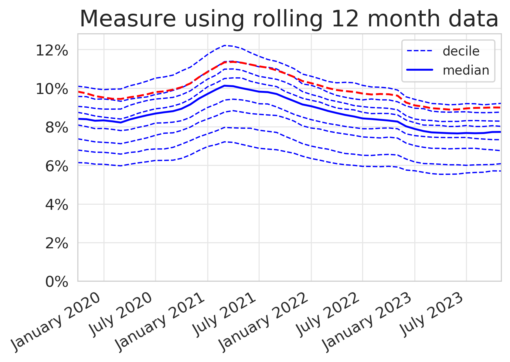
Different time periods can make a direct comparison of results tricky. In OpenPrescribing, the individual monthly figures are presented. Whereas on the PrescQIPP platform for example, for this measure, a monthly rolling average of the last 12 months data is reported.
To help describe the difference, we have generated two plots for the same measure in the same locality using different time periods below. One is reported using monthly data, the standard for OpenPrescribing, and the other uses a 12 month rolling average which can be found on other platforms. You can almost immediately see that there is a difference in the analytic choice made for this measure by the shape of the plots generated on each platform. In OpenPrescribing the individual monthly figures create a saw tooth effect rather than the smooth plot we see in the plot with a 12 month rolling average.
Number of prescription items for co-amoxiclav, cephalosporins and quinolones as a percentage of total prescription items for cephalosporins, macrolides, metronidazole tinidazole & ornidazole, penicillins, quinolones, sulphonamides & trimethoprim, tetracyclines and drugs for urinary-tract infections.
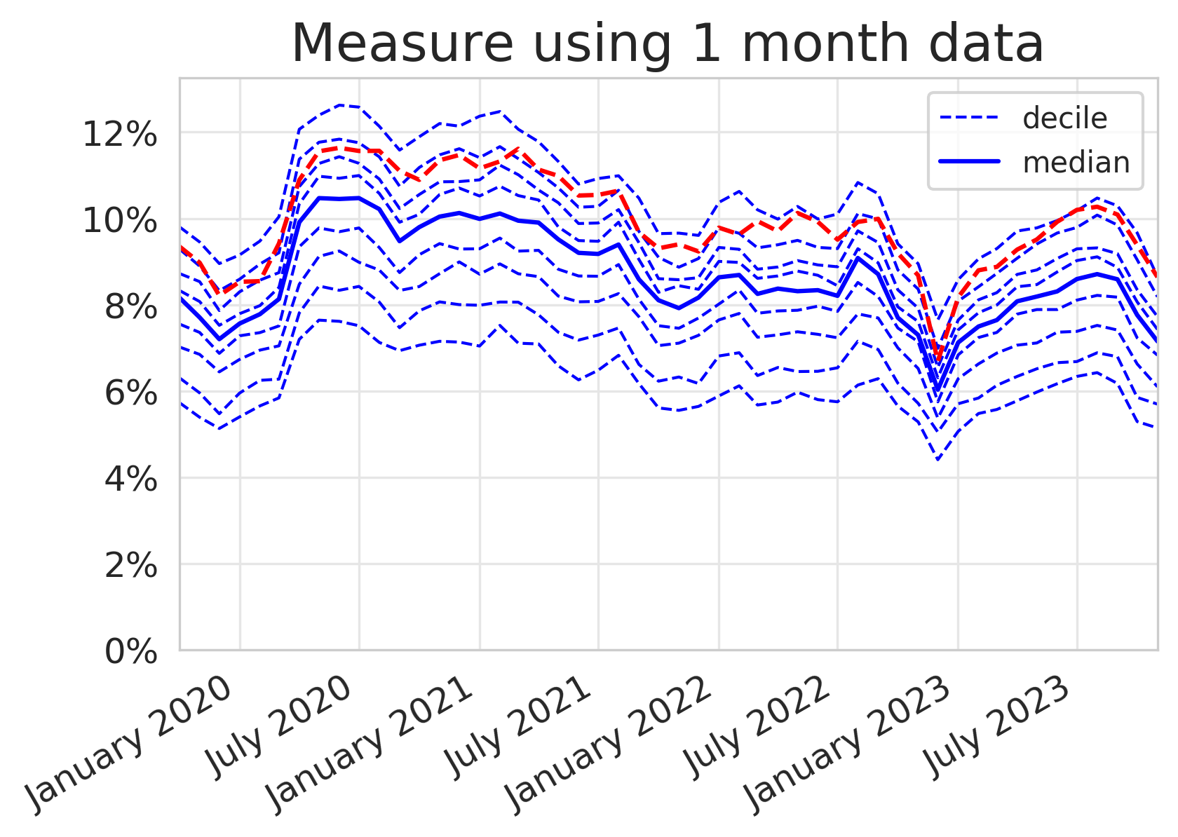
At OpenPrescribing we prefer to use a monthly report because we can then identify variation in practice in near real time and observe important seasonal variation. Antibiotics show the most seasonality, which can make looking for trends harder to spot. In response to feedback from our users, we have previously explored methods to smooth seasonality to give users an overall impression of their prescribing practices summarised in this blog and in more detail here.
Definition of the numerator/denominator
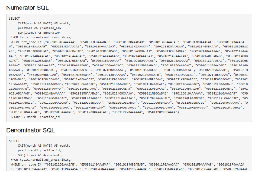
Understanding the ‘makeup’ of the numerator and denominator are essential when trying to work out why results may have been reported differently. In OpenPrescribing we use a subset of antibiotics from BNF 5.1, described using the antibiotic/class name (cephalosporins, macrolides, metronidazole tinidazole & ornidazole, penicillins, quinolones, sulphonamides & trimethoprim, tetracyclines and drugs for urinary-tract infections). For complete clarity, the denominators are also broken down by individual BNF codes in the technical detail section of each measure on OpenPrescribing.
For this query, we cannot be sure whether the other platforms are including the same antibiotics because the individual antibiotics or BNF codes which make up the denominator do not appear to be available in the public domain, to allow us to cross-check.
Back to our original query, why does OpenPrescribing show a positive trend and the other data analysis platforms, a negative trend? We were able to suggest that the difference in trend is most likely due to the difference in time periods but without openly available code we could not be completely sure of some of the analytic choices made by the other people running the other platforms.
Each platform shares their method to a varying degree. At OpenPrescribing we make all of our ‘workings out’ open to everyone. We value openness and transparency as we believe open discussion of ideas and methods are the key ingredients for high quality data analysis. All our code is openly available on our Bennett Institute GitHub so that all our methods for data preparation, analysis and visualisation can be reviewed, compared and importantly re-used by anyone. In all of our measures, we have a link option to view the technical details for this measure. Anyone who is interested can see the SQL (code) for the numerator and denominator and even click through to GitHub where you can see any updates that have been made and why, and when the measure is due to be reviewed.
We believe that the more detail there is available in the public domain, the easier it is to be able to compare and spot any differences.
Summary
There are likely to be some differences in analyses performed on different platforms due to differences in source datasets, and analytic choices. It is important to say that this is not a criticism of the people behind the other data analysis platforms. We do hope though, that others adopt open and transparent ways of working that would mean all methodology and code would be able to be re-used by anyone and be available for inspection as needed in the public domain at any time.
Whilst direct comparison is not always possible, comparing with other data resources is often helpful and it is often a good way to provide assurance. Our close working with people such as BSA and PrescQIPP enables us to make educated guesses about small expected differences and is helpful just in case there is a large unexpected difference. If you spot any such differences which cannot be explained by different source datasets or analytic choices whilst using our tools please do get in touch at bennett@phc.ox.ac.uk and we will be happy to help investigate.